Monitor Adjustment Test Patterns
Many monitors are used with their brightness and contrast controls set too high. This
results in an image that looks correct on screen but does not closely match the colors
that will print. Calibrating your display sets the brightness and contrast controls so
that you see the most detail possible in the dark shadows and bright highlights of your
images. You should calibrate your display any time you change your computer monitor or
the lighting around your computer. To make images on screen look more like they will
look when printed:
|
|
|
|
|
|
|
|
|
|
|
|
|
|
|
|
|
|
|
|
|
|
|
|
|
|
|
|
|
|
|
|
|
|
|
|
|
|
|
|
|
|
|
|
|
|
|
|
|
|
|
|
|
The primary colors:
| Red | Yellow | Magenta | Green | Cyan | Blue |
|
|
|
|
|
|
|
The height and width of this image should be equal.
Check with a ruler and
adjust your monitor as needed.
 |
A couple more test patterns from the web:
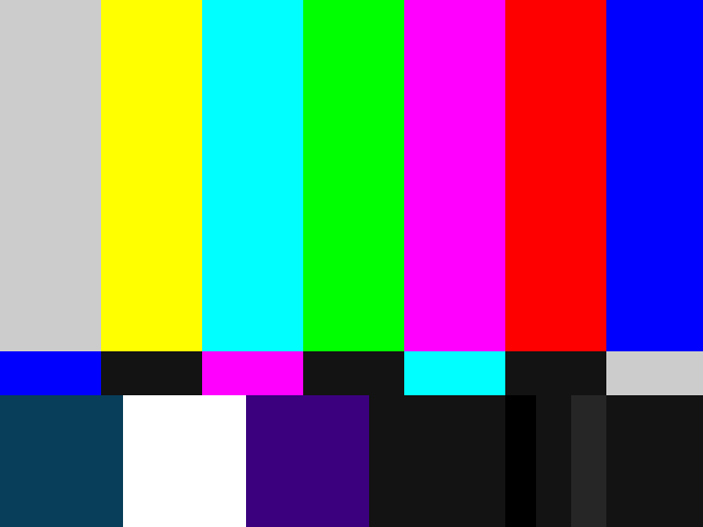
SMPTE Test Pattern